Revitalizing a Classic: The Paper Mario Remake
The Power of Limitations
Limitations can often be a surprising advantage for artists. This was evident with the original Paper Mario on the Nintendo 64. Initially, it might seem doubtful that a graphical upgrade could enhance an older classic. Typically, both players and the gaming industry equate better graphics with more realism. However, Link’s Awakening on the Switch challenged this notion by using the console’s capabilities to create a vibrant, nostalgic, toylike aesthetic, all while preserving the original game’s essence.
A New Challenge for Paper Mario
Paper Mario: The Thousand-Year Door faced a different kind of challenge. Released for the GameCube, the game was already part of the second generation of 3D-capable consoles. By then, the flat, paper-crafted aesthetic was well-established. Any remake would have to meet the vivid memories fans held of the original. This is why the new Switch remake feels so remarkable.
Enhanced Visuals in Paper Mario: The Thousand-Year Door
Attention to Detail
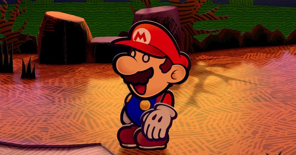
From the moment I started the new Paper Mario: The Thousand-Year Door, I was amazed by how much the world resembled actual paper. “Isn’t this what it’s supposed to look like?” I wondered. But even paper has depth, albeit minimal—especially the sturdy kind used for dioramas. Nintendo has meticulously acknowledged this fact in the remake, making it a standout among rebooted classics.
 Courtesy of Nintendo,
Subtle Enhancements
In the original game, Mario and his friends appeared as flat planes with black outlines, mimicking drawings rather than computer graphics. This design remains in the remake, but now there’s a faint white highlight around the edges of the character models, similar to actual paper cutouts. This subtle yet pervasive detail enhances the handmade feel of the models.
Immersive World Design
Every element of the world reflects this attention to detail. For instance, when you first enter Rogueport, there’s a platform in the main square with a noose. In the original, the wooden steps were straight and flat, with everything at right angles. It worked as a background element, with the flat noose cutout swaying in the wind.
In the remake, however, the steps are slightly crooked and uneven. The side pieces look bent, as if a child had forced them too hard while assembling the steps. It appears fragile, as if a mild gust could topple it. These details, though seemingly minor, make it easy to get absorbed into Paper Mario‘s world.
Modern Graphics Enhancing Classic Design
This is a case where the improved graphics of a modern console enhance the original game’s design choices. While Switch graphics could make Mario and his friends look more realistic, in this instance, it makes them appear more handmade, like intricate paper crafts.

1 Comment
Hasn’t Paper Mario: The Thousand-Year Door set the standard for engaging storytelling in games?!